What would I build

An analytics product, where the numbers are the product

Some products are a workflow with a chart on the end. Others are the chart. If yours is the second kind, the interesting problem is not drawing them: it is defining a measure once, keeping it fast, and being certain that one customer's dashboard can never show another customer's rows.

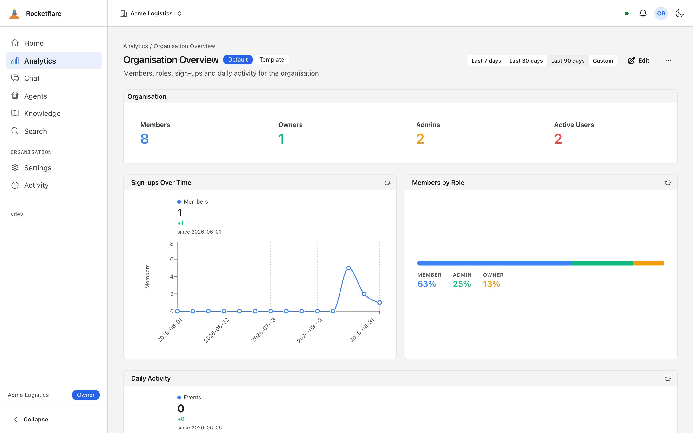
An organisation overview dashboard with headline numbers and charts An organisation overview dashboard with headline numbers and charts
A dashboard copied from a template in the repository, showing one organisation's own data.
On the first run

What is already there

The semantic layer is drizzle-cube, which is a separate open source project, wired in and scoped here.

A measure is defined once

Active users, revenue, whatever your domain calls its numbers: written down in one place as a measure over your own tables, then used by every chart, every filter and every export. The second definition is where reporting systems start disagreeing with themselves.
Dashboards per customer, from templates you keep in code

A template is a typed object in the repository. Each organisation gets its own copy on creation, and can edit it without touching yours. Add a template later and existing customers pick it up.

Summary tables, rebuilt on a schedule

The expensive aggregates are pre-built per organisation by an hourly job rather than computed on every page load. There is a freshness check, so stale is something you can see rather than something a customer reports.

Every query scoped to one customer

The scoping lives inside each cube, not in the page that renders it. A test runs every cube as two different organisations and fails if either can see the other, and a new cube without a case in that test fails the build.

A question you did not anticipate

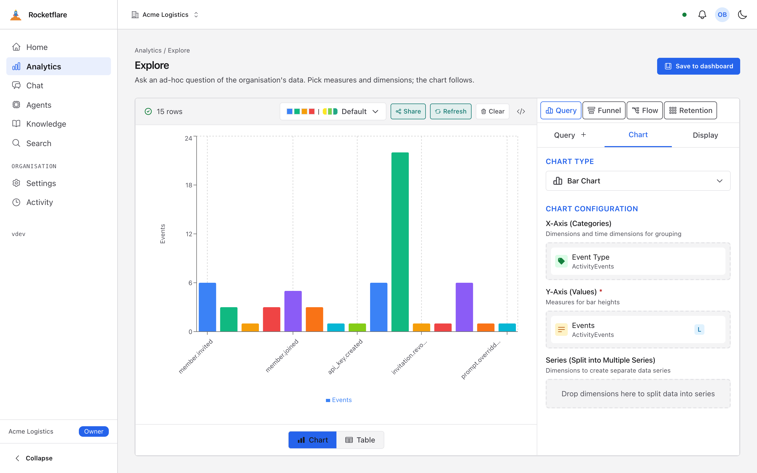
The same layer is exposed as a query endpoint, so a customer with an analyst can ask something you never built a chart for, still scoped to their own rows.

An endpoint an AI client can point at

The same cubes, the same scoping, in the shape an MCP client expects. Not a second implementation, which is the only reason it is safe to have at all.

The layer itself is drizzle-cube, open source and usable on its own. What the kit adds is the scoping, the per organisation dashboards and the test that keeps both honest.

The questions you did not build for

One layer, three ways in

A dashboard, an ad hoc query, and an endpoint an AI client can use. All three run the same cubes with the same customer filter.

This is the part that is hard to retrofit. If charts are built page by page, the ad hoc query is a second implementation with its own idea of what a measure means and its own chance of forgetting the filter. Defining the measure once is what makes the other two free and safe.

Read the analytics concept
The explore view, building a query from measures and dimensions The explore view, building a query from measures and dimensions
Where to start

Four steps, in order

  1. Look at the dashboard that ships

    The demo organisation has a populated overview built from the same pieces you would use. Open it and then open the template it was copied from.

  2. Write one cube over one of your tables

    A measure, a dimension, and the filter that ties it to the organisation. That filter is the whole safety story, and it is one line.

  3. Add its case to the isolation test

    The test compares its own list of cases against the list of cubes, so this is not optional. That is deliberate.

  4. Put it on a template

    Add the chart to a dashboard template, and every organisation gets it. Existing ones pick it up without a migration.